← HTML & CSS

Media queries (responsive design)

A CSS rule used to apply different styles for different media types or screen sizes.

What it does: The landscape orientation keyword matches devices where viewport width exceeds height dimensions. The and keyword strings screen target constraints alongside specific feature conditions. @media is a rule built directly into CSS to control conditional layouts. max-width applies styles if the viewport width is less than or equal to the defined value. CSS requires media features to be enclosed within round parentheses. Portrait mode means the device screen is taller than it is wide. The 'and' operator allows developers to combine features like screen types and specific widths. All at-rules in CSS, including media queries, must start with the @ symbol character.

Common mistakes: Line 0 is incorrect because it is missing the mandatory @ character at the beginning of media. Line 1 is incorrect because CSS properties inside a media query block must use colons (:), not equals signs (=).

Class: _____________________  ·  Name: _____________________  ·  Date: _________

Free printable worksheet with full answer key — or add this module to a journey and assign it to your class.

Take this worksheet further — free with Cloodit

Each concept is reinforced from every angle — learned, then applied, then tested.

Learning
Duo
Is @media a native CSS rule or an HTML layout tag?
CSS ruleHTML tag
Matches
@media max-width: 768px { p { color: blue; } }
Fails because media feature expressions like max-width must be enclosed in parentheses.
Applying
Meanings
Term
@media
Meaning
A CSS rule used to apply different styles for different media types or screen sizes.
Practice
.card {
Testing
Gaps
(max-width: 600px) {
Check Answer
Spots
1media (max-width: 700px) {
2 .box { width: 100%; }

Cloodit turns curriculum-aligned coding content into journeys students work through one biome at a time.
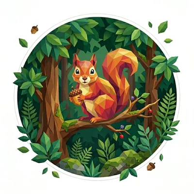
The 'Squirrel' badge — Module Hoarder, one of Cloodit's 106 collectible badges
Students earn collectable badges

Over 100 of them, across seven natural biomes.

Study Buddy
Students build a real study resource

Turns their work into revision material ready for Flash Cards and Exam study.
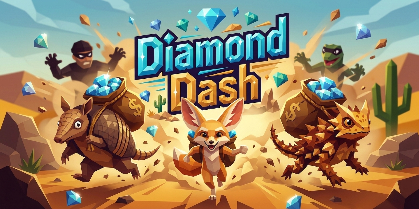
Diamond Dash — one of Cloodit's live, competitive Sprint games
Students lock in with Sprints

Live, competitive practice for the start of the lesson or a teacher-led lesson finisher.
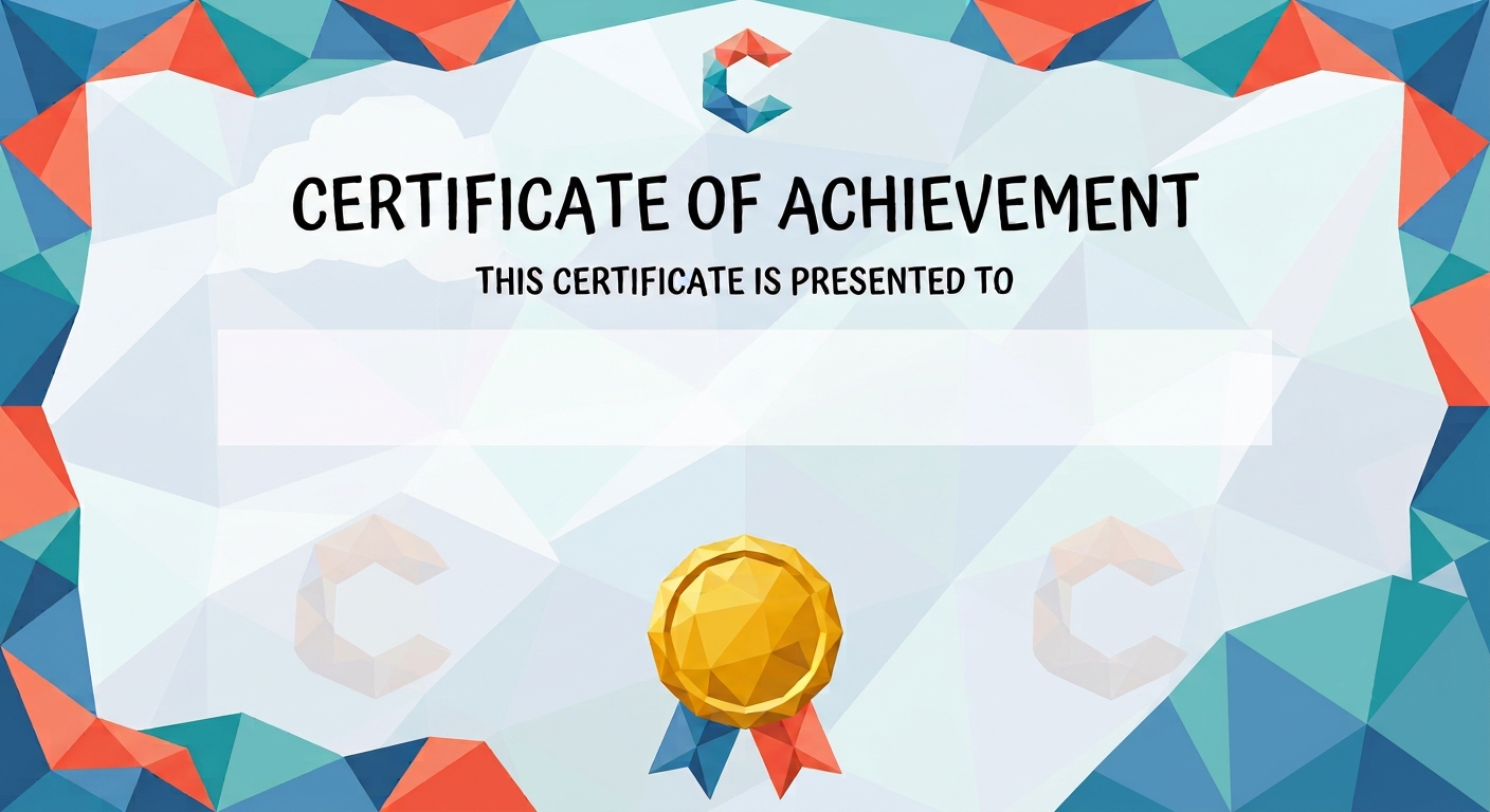
A Cloodit certificate of achievement, ready to personalise and print
Custom printable certificates

Honour your top performers, or encourage a student who's trying hard — ready to print in seconds.

Quick Questions

1. Is @media a native CSS rule or an HTML layout tag?
A. CSS rule ✓
B. HTML tag
@media is a rule built directly into CSS to control conditional layouts.
2. Which media feature targets screens smaller than or equal to a specific width dimension?
A. min-width
B. max-width ✓
max-width applies styles if the viewport width is less than or equal to the defined value.
3. Which character tokens must wrap a media feature condition like max-width: 768px?
A. Parentheses ( ) ✓
B. Square brackets [ ]
CSS requires media features to be enclosed within round parentheses.
4. What condition does @media (orientation: portrait) evaluate?
A. Viewport height is greater than or equal to width ✓
B. Viewport width is greater than height
Portrait mode means the device screen is taller than it is wide.
5. Can you join multiple media query conditions together using the 'and' logical keyword?
A. Yes ✓
B. No
The 'and' operator allows developers to combine features like screen types and specific widths.

Match the Pairs

@media (max-width: 600px) { .box { display: none; } } Hides elements with the box class on screens that are 600 pixels wide or smaller.
@media (min-width: 1024px) { body { font-size: 18px; } } Increases body text font size for desktop screens 1024 pixels wide or larger.
A responsive design rule that applies specific styles when a device is held horizontally. @media (orientation: landscape) { .nav { height: 50px; } }
Combines screen type and a maximum width condition to style mobile devices. @media screen and (max-width: 480px) { img { width: 100%; } }
@media max-width: 768px { p { color: blue; } } Fails because media feature expressions like max-width must be enclosed in parentheses.
media (min-width: 480px) { h1 { font-size: 2rem; } } Fails because it is missing the mandatory @ character at the very beginning of the rule.

Key Term

@media
A CSS rule used to apply different styles for different media types or screen sizes.

Fill in the Blanks

1. @media (max-width: 600px) { body { color: red; } }
Hint: Type the keyword that initiates a media query rule
2. @media (min-width: 768px) { .nav { display: block; } }
Hint: Type the feature used to target screens wider than a minimum width
3. @media (max-width: 480px) { .sidebar { display: none; } }
Hint: Type the feature used to target screens narrower than a maximum width
4. @media screen and (max-width: 900px) { .card { width: 50%; } }
Hint: Type the media type keyword representing digital screens
5. @media (orientation: landscape) { .hero { height: 100vh; } }
Hint: Type the orientation mode that targets screens wider than they are tall

Spot the Error

Question 1
A media (max-width: 700px) {
B .box { width: 100%; }
C }
Line A — Line 0 is incorrect because it is missing the mandatory @ character at the beginning of media.
Question 2
A @media (max-width: 600px) {
B .container { width = 100%; }
C }
Line B — Line 1 is incorrect because CSS properties inside a media query block must use colons (:), not equals signs (=).
Question 3
A @media (min-width: 768px) {
B .nav {
C display flex;
D }
E }
Line C — Line 2 is incorrect because the colon separating the display property and its value is missing.
Question 4
A @media (min-width: 800px) {
B .grid {
C display: grid;
D } pixels
E }
Line D — Line 3 is incorrect because the trailing word pixels is invalid syntax after a closing brace.
Question 5
A @media screen-only and (max-width: 500px) {
B body { background: white; }
C }
Line A — Line 0 is incorrect because screen-only is an invalid media type; you should use screen instead.
For Teachers

Create a free class, add this module to a journey, and track who's stuck.

Create a free teacher account →

No credit card. No setup fee. Make a class and invite students in under three minutes.

For Students

Practice this topic interactively, track progress, and unlock badges.

Start Learning Free →

Have a class code?