← HTML & CSS

CSS Grid placement

Shorthand property that specifies a grid item's size and location within the grid columns by defining its start and end lines.

What it does: The negative coordinate index -1 matches against any terminal boundary lines dynamically. grid-area provides an all-inclusive placement method for row and column track indexes. The slash operator parses grid boundary segments neatly, like 1 / 4. -1 references the reverse terminal boundary line, which is useful for full-bleed layouts. The keyword span declaration followed by a number expands layout footprints sequentially. Track placement rules apply to specific child elements to map them inside container boundaries. The numbers indicate absolute grid line indices, meaning it spans 3 complete tracks. Combining a start line index with span defines a dynamic track offset allocation block.

Common mistakes: Line 0 has invalid selector syntax. Remove the extra 'class' keyword. Line 0 is incorrect because a colon cannot be placed between the class selector and the opening brace.

Class: _____________________  ·  Name: _____________________  ·  Date: _________

Free printable worksheet with full answer key — or add this module to a journey and assign it to your class.

Take this worksheet further — free with Cloodit

Each concept is reinforced from every angle — learned, then applied, then tested.

Learning
Duo
Which property positions a grid item horizontally between column lines?
grid-columngrid-row
Matches
.item { grid-column: 1, 3; }
Separating grid placement boundaries with a comma instead of a forward slash.
Applying
Meanings
Term
grid-column
Meaning
Shorthand property that specifies a grid item's size and location within the grid columns by defining its start and end lines.
Practice
.featured-item {
Testing
Gaps
: 1 / 3;
Check Answer
Spots
1.item class {
2 grid-column: 1 / 3;

Cloodit turns curriculum-aligned coding content into journeys students work through one biome at a time.
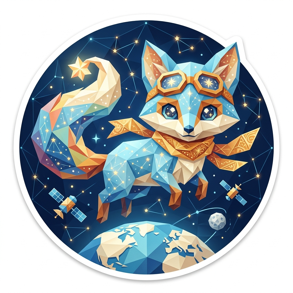
The 'Star Fox' badge — Frozen Master, one of Cloodit's 106 collectible badges
Students earn collectable badges

Over 100 of them, across seven natural biomes.

Study Buddy
Students build a real study resource

Turns their work into revision material ready for Flash Cards and Exam study.
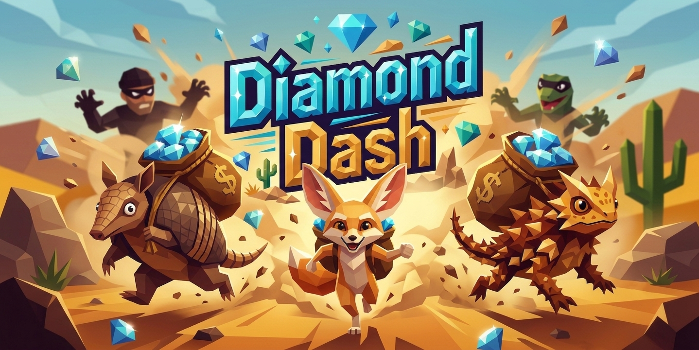
Diamond Dash — one of Cloodit's live, competitive Sprint games
Students lock in with Sprints

Live, competitive practice for the start of the lesson or a teacher-led lesson finisher.

A Cloodit certificate of achievement, ready to personalise and print
Custom printable certificates

Honour your top performers, or encourage a student who's trying hard — ready to print in seconds.

Quick Questions

1. Which property positions a grid item horizontally between column lines?
A. grid-column ✓
B. grid-row
grid-column explicitly coordinates horizontal track borders inside a template structural frame.
2. What character separates the starting line from the ending line in shorthand placement?
A. Forward slash ( / ) ✓
B. Colon ( : )
The slash operator parses grid boundary segments neatly, like 1 / 4.
3. What line number can you use to target the very last line of an explicit grid layout?
A. -1 ✓
B. 0
-1 references the reverse terminal boundary line, which is useful for full-bleed layouts.
4. Which syntax correctly makes a block stretch across exactly three tracks?
A. span 3 ✓
B. expand(3)
The keyword span declaration followed by a number expands layout footprints sequentially.
5. In the grid-area shorthand, which value comes first in the sequence?
A. grid-row-start ✓
B. grid-column-start
grid-area parses parameters in this order: row-start / column-start / row-end / column-end.

Match the Pairs

.item { grid-column: 1 / 4; } Places an item spanning from column line 1 up to column line 4.
.item { grid-row: 2 / span 2; } Starts an item at row line 2 and stretches it across 2 row tracks.
Stretches a layout block completely from the first column line to the last grid edge. .item { grid-column: 1 / -1; }
Consolidates all row and column boundaries cleanly within a single instruction rule. .item { grid-area: 1 / 2 / 3 / 5; }
.item { grid-column: 1, 3; } Separating grid placement boundaries with a comma instead of a forward slash.
.item { grid-row: span(2); } Treating the span layout keyword as if it were a function call with parentheses.

Key Term

grid-column
Shorthand property that specifies a grid item's size and location within the grid columns by defining its start and end lines.

Fill in the Blanks

1. .item-a { grid-column: 1 / 3; }
Hint: Type the shorthand property that defines column placement lines
2. .item-b { grid-row: 2 / 5; }
Hint: Type the shorthand property that defines row placement lines
3. .sidebar { grid-column: 1 / span 2; }
Hint: Type the keyword used to stretch an item across multiple tracks
4. .header { grid-area: 1 / 1 / 2 / 5; }
Hint: Type the mega-shorthand property setting rows and columns together
5. .footer { grid-column: 1 / -1; }
Hint: Type the track line number to start at the first column edge

Spot the Error

Question 1
A .item class {
B grid-column: 1 / 3;
C grid-row: 1 / 2;
D }
Line A — Line 0 has invalid selector syntax. Remove the extra 'class' keyword.
Question 2
A .box: {
B grid-column: 1 / 3;
C grid-row: 2 / 4;
D }
Line A — Line 0 is incorrect because a colon cannot be placed between the class selector and the opening brace.
Question 3
A .panel {
B grid-column-start-end: 1 / 3;
C grid-row: 1 / 2;
D }
Line B — Line 1 is incorrect. There is no grid-column-start-end property; use the grid-column shorthand instead.
Question 4
A .sidebar {
B grid-column: 1 to 4;
C grid-row: 2 / 3;
D }
Line B — Line 1 is incorrect. The 'to' keyword is invalid; use a forward slash (/) to separate start and end lines.
Question 5
A .main {
B grid-column: 1 / 4;
C grid-rows: 2 / 3;
D }
Line C — Line 2 is incorrect. The property name is singular: grid-row, not grid-rows.
For Teachers

Create a free class, add this module to a journey, and track who's stuck.

Create a free teacher account →

No credit card. No setup fee. Make a class and invite students in under three minutes.

For Students

Practice this topic interactively, track progress, and unlock badges.

Start Learning Free →

Have a class code?